How the Medium Shapes the Message
Touch—it’s one of the five senses that dictates how we perceive the world around us. It’s also one of the most important. Sappi’s groundbreaking book, written in collaboration with renowned neuroscientist Dr. David Eagleman, dives deeper into haptics, the science of touch. It explores why touch is such a crucial part of the sensory experience and how it influences emotion and decision making, establishing this sense as critical to any brand experience.
Brands that really know how to engage their customers are brands that have mastered the science of touch. They understand how to leverage haptics to create impactful marketing pieces that forge memorable and meaningful connections between brand and customer. This episode looks at why high-quality paper is the best medium to deliver memorable messaging.
Watch the video: https://www.sappi.com/neuroscience-video-6
Read More
Artist Emmanuelle Moureaux Uses Centimeter-level Measurement Accuracy as a Motif in Her Latest Paper Art Installation
Presented for the exhibition ‘Space in Ginza’ at METoA METoA in Tokyu Plaza Ginza, Moureaux's ‘I am here’ comprises the silhouettes of 18,000 women in 100 different colors. these paper pieces express the non-stop flow of pedestrians that occupy the bustling district of japan. seemingly lost within the vibrant mass of paper people are three silhouettes — two girls and one cat — encouraging visitors to seek them out within the many layers of the installation. Just like looking for the ‘lost’ silhouettes in the crowd, the installation serves a reminder for visitors to rethink where they belong.
https://www.designboom.com/art/emmanuelle-moureaux-18000-paper-silhouettes-100-colors-i-am-here-ginza-japan-09-07-2016/
Read More
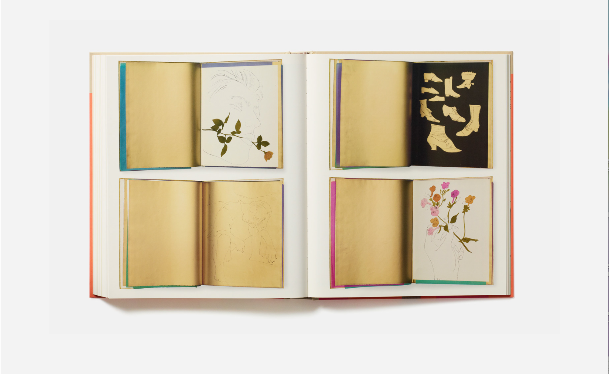
Meta Data: A New Tome Celebrates Artists Who Use Books as a Medium
Does printed matter really still matter? Anyone will be quick to tell you that, in the digital age, books are an antiquity soon to be obsolete. But as a new tome by Phaidon demonstrates, the possibilities of books are truly endless.
Read more at https://www.wallpaper.com/art/artists-who-make-books#PZgWWB7VeEoaB0qJ.99
Read More
Russian Paper Artist Asya Kozina reinterprets Baroque Wigs with a Modern Flair
Following a similar aesthetic style to the ornamental wigs of the baroque and rococo periods, paper artist Asya Kozina creates ornate headdresses that pay homage to one of the most outrageous luxuries and stylized trends in history. The artist began experimenting with these paper creations in her initial paper, costume series published in 2015. With this second edition, the artist adds an additional artistic flare by integrating symbols of modern industrialization and advancement into the towering paper compositions.
https://www.designboom.com/art/asya-kozina-baroque-wigs-paper-10-15-2017/
Read More
Christian Lacroix SS2017 Stationery Collection
The House of Christian Lacroix Spring-Summer 2017 collection gives pride of place to enlightened eclecticism and exoticism. Each richly decorated notebook is an invitation for a voyage of discovery to enjoy different styles, eras and destinations. From fascinating still lifes to an imaginary jungle, each different decor ensures we want to see what happens next.
Behold: http://christian-lacroix.com/eng/blog/53_SS2017-Stationery-collection
Read More
Made With Paper and Scissors, Swedish Artist Bea Szenfeld’s Designs Rock
Never coming up flat is the work of Bea Szenfeld, a Polish-born, Stockholm-based artist whose medium is paper. Szenfeld worked as a ceramicist and sculptor before pursuing a fashion degree at Beckmans College of Design in Stockholm. After graduating, she landed a job in the industry. Quickly realizing that working with commercial clothes was not her thing, she “jumped back to work with clothes in art.” Inspired by the experimental garments she made at school, Szenfeld chose to work again with paper.
Each garment is handmade in a process that might be described as analog, and is constructed using materials that can be found in any corner stationary or hardware store: scissors, tape, staples, bone folder, needle and thread, paper, sometimes a glue gun or drill. Some of Szenfeld’s pieces feature origami folds, others are accumulations of thousands of individual pieces, some separated by a small pearl.
Explore the collection here > https://www.vogue.com/article/swedish-artist-bea-szenfeld-paper-clothing
Read More
Meet the Artists Behind the 40,000 Paper Flowers in Dior’s Les Arts Décoratifs Installation
Since 2012, Wanda Barcelona has been the creative group behind the hyperreal paper flowers and plants at Dior exhibitions and events around the world. To boot, the trio (made up of Botero, Daniel Mancini, and Iris Joval) has also created installations for Hermès, Karl Lagerfeld, Comme des Garçons, Colette, Zara, and events at Cannes since they founded their company in 2007. But the latest project from the Barcelona-based group might just be the most stunning yet: gorgeous paper blooms that resemble wisteria and lily of the valley hanging over some of Dior’s most beautiful gowns of all time at the Musée des Arts Décoratifs in Paris. The exhibition opened earlier this month, and to say Wanda Barcelona’s blooms are a main fixture of the exhibition would be an understatement.
Visit the exhibition here > https://www.vogue.com/article/dior-les-arts-decoratifs-paper-flowers-artist
Read More
A New Paper Collection that Shows Its Character: Gmund Wood
Inspired by the permanence of nature and by the “green” trend, the paper experts from Gmund have created a new landmark: the “Gmund Wood” collection. Color, sheen, texture and real wood grain are its incomparable characteristics.Wood is the epitome of naturalness and ecology. This authentic natural material served as the model for the new collection’s surface textures and patterns. This paper is unmistakable, as are its color variants. From Abura, through Limba to Tindalo, nine different colors are available. Each of the nine is named after a genuine wood variety from around the globe and each color closely resembles the natural hue of its namesake.
Take a look here > https://us.gmund.com/content/en/new-paper-collection-gmund-wood
Read More
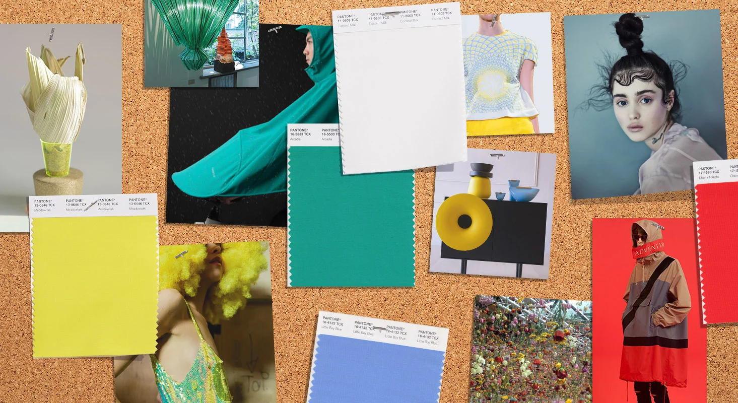
Pantone Fashion Color Trend Report: NY Fashion Week S/S 2018
Each season the team at the Pantone Color Institute creates the PANTONE Fashion Color Trend Report; a color overview highlighting the top colors fashion designers showing at NY Fashion Week will be featuring in their collections for the upcoming season. With color on the catwalk a key indicator of the color stories we can expect to see showing up across all areas of design, the PANTONE Fashion Color Trend Report is your easily accessible guide to the season’s most important color trends
See the color story for Spring 2018 here: http://www.pantone.com/fashion-color-trend-report-new-york-spring-2018
Read More
Paper Cities Enclosed in Glass by Japanese Artist Ayumi Shibata
Japanese artist Ayumi Shibata uses traditional methods of Japanese paper cutting to create miniature cities inside of glass vessels. Her chosen materials reference the delicate relationship humans have with our environment and natural forces of our world, while also relating to the Japanese translation of “paper.” In Japanese, the word for “paper” is “Kami,” which can also mean “god,” “divinity,” or “spirit.” Kami are omnipresent in the Shinto religio, and reside in the sky, ground, trees, and rocks.
Explore more here: http://strictlypaper.com/blog/2017/03/paper-cities-enclosed-in-glass-by-ayumi-shibata/
Read More
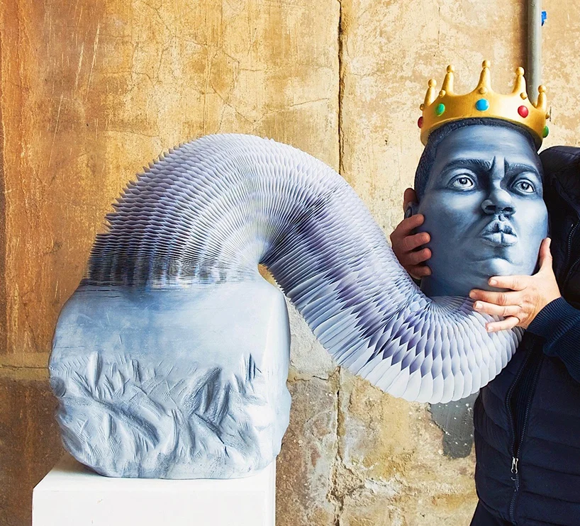
Artist Creates Stretching Paper Sculpture of Notorious B.I.G.
New York based artist Felix Semper’s stretchable paper sculptures at first glance appears to be a stone bust, when in fact this sculpture of Notorious B.I.G. is entirely comprised of hundreds of layers of paper that have been glued together and meticulously carved. Felix’s stretchable paper sculptures are inspired by traditional marble stone busts. Through this fluid movement each sculpture has an added playful mobility as opposed to the traditional aesthetic. He has transformed the medium to stretch, twist, elongate and retract.
Continue reading here: http://strictlypaper.com/blog/2017/05/felix-semper-stretching-paper-sculpture-of-biggie-smalls/
Read More
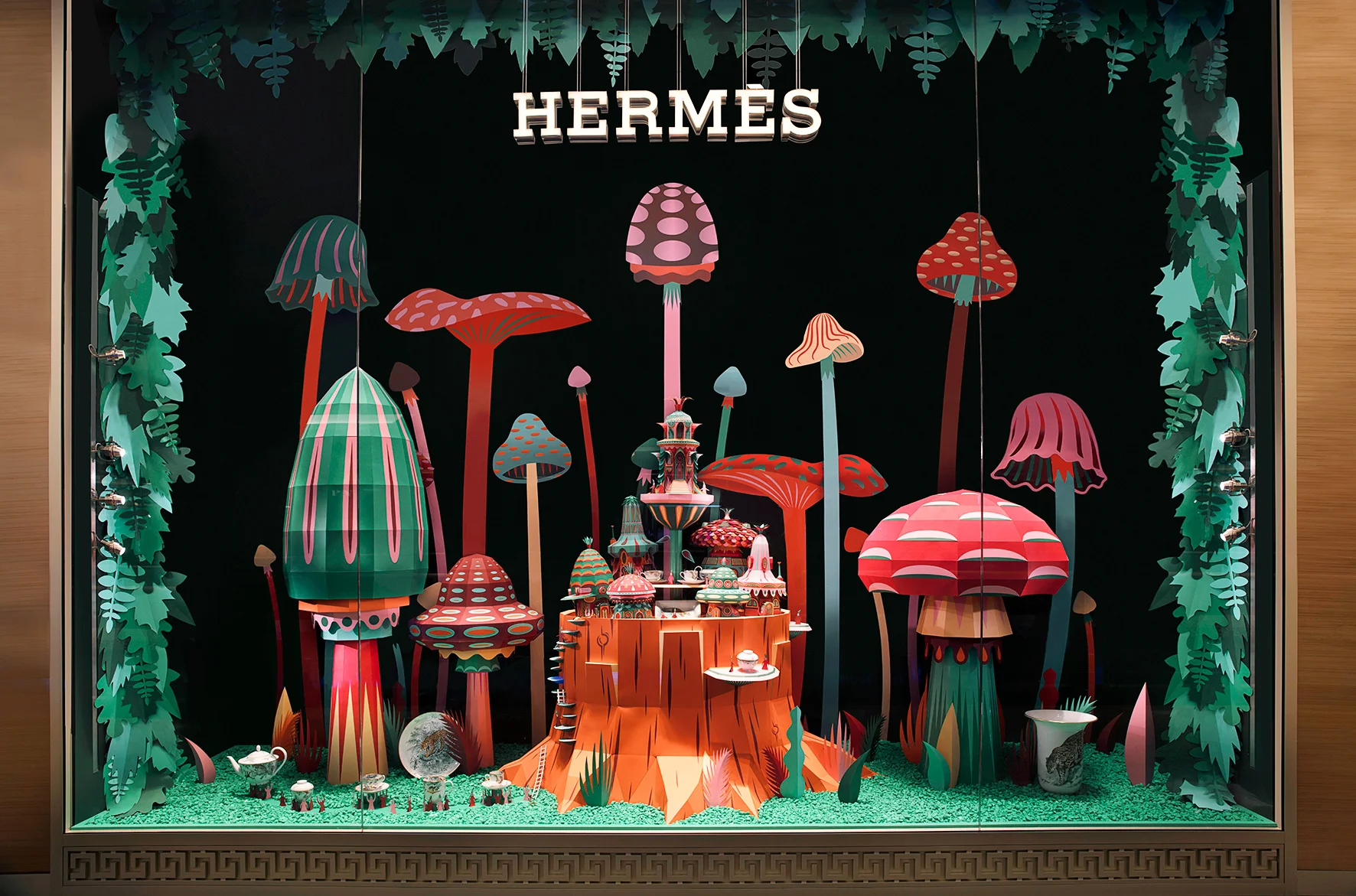
Fantastic Miniature Worlds Bursting with Color for Hermes' Window Display in Dubai
These two paper craft window displays are for the opening of a new Hermès store in Dubai (Mall of the Emirates). Through this project, spectators have a sneak peek at the curious characters living inside this nature filled environment. One window has a motif of a mushroom village, while the other shows blooming flower huts. This microscopic point of view shows plants and other vegetal life reigning as masters, like a kind of picture, a flash, a precise instant in nature’s unrestrained run.
See more here: http://strictlypaper.com/blog/2017/01/zim-and-zou-dubai-window-display-for-hermes/
Read More
G.F. Smith's Ocean-Inspired 'Tidal' Paper Installation Takes Centre Stage in its New London Showroom
In an increasingly digital world, a company like G.F Smith is a testament to the enduring and unique appeal of paper. Founded in London in 1885, the Hull-made paper brand has spent 131 years building its reputation on quality and service to become the UK’s largest specialist paper company. Last December, the opening of its first ever showroom, sees the G.F Smith brand turn the page to an exciting new chapter.
Read more at https://www.wallpaper.com/design/gf-smith-opens-first-ever-showroom-in-london#v9lZeAbFmRiJTKi2.99
Read More
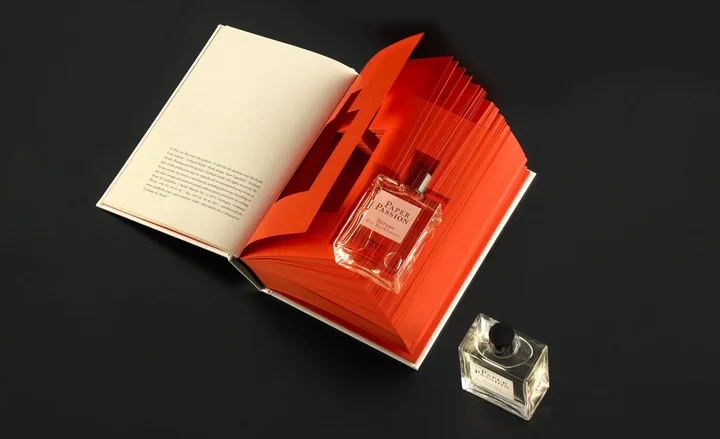
The Silent Smell of Paper
Designed by boutique perfumer Geza Schoen in close consultation with Gerhard Steidl and in collaboration with Wallpaper* magazine, the perfume expresses that peculiar mix of paper and ink which gives a book its unmistakable aroma, along with the fresh scent which a book opened for the first time releases.
Behold the smell of a freshly printed book: https://www.wallpaper.com/lifestyle/paper-passion-by-geza-schoen-steidl-wallpaper-and-karl-lagerfeld
Read More
What's the Difference Between a Font and a Typeface?
Do you grit your teeth if someone says “font” when he or she really means “typeface?” Does bad kerning just about ruin your day? Do you practically weep when a designer looks baffled at your ever-so-subtle suggestions to use proper ligatures? Get ready to load up your typefaces, line up your tabs, and take our challenge to find out just how much you really know about all things typographic.
Test your typography terms here: https://eyeondesign.aiga.org/whats-the-difference-between-a-font-and-a-typeface-take-aigas-ultimate-typography-quiz/
Read More
Odin Asked a Paper Engineer to Package it's Latest Fragrance
After years of success with their best-selling Black Line of smoky, woody scents, the creative team at Odin took a sharp left turn with their White Line, a trio of citrusy, floral fragrances with a whole new olfactive palette. Nothing signals change to a consumer more quickly than new packaging, so Odin co-founder Eddy Chai reached out to paper engineer Matthew Shlian. The results took the collection to an even higher level.
See the story behind the design: https://eyeondesign.aiga.org/why-odin-asked-a-paper-engineer-to-package-its-latest-fragrance/
Read More
G. F Smith Reveals the World's Favourite Colour with New Installations by Artists and Designers
Finding the world’s favourite colour may sound like a ambitious and daunting task, yet it is one that, earlier this year, G. F Smith took on with gusto. A global survey ensued, with thousands of people from over 100 countries worldwide voting for their most beloved shade. The Hull-based paper manufacturer announced Marrs Green – a deep green hue with a tinge of blue – as the winning colour. Submitted by survey participant Annie Marrs who was inspired by the landscape that surrounds her home in Scotland, the teal shade now joins G . F Smith’s Colourplan range as the 51st shade, and is available for use by designers, brands and individuals via their website.
To celebrate the launch, G. F Smith has curated the exhibition ‘Paper City’ – a showcase of beautiful and surprising installations, that will be on display across a number of locations in Hull where the brand has been based since 1885.
Explore the exhibition here: https://www.wallpaper.com/design/gf-smith-worlds-favourite-colour-paper-city-exhibition-hull#202574
Read More
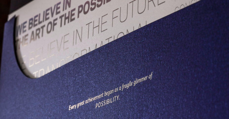
Fine German Paper with Metallic Flare
A laboratory for the way music is taught, presented and experienced, New World Symphony, America’s Orchestral Academy prepares graduates of distinguished music programs for leadership roles in the world’s fore- most orchestras and ensembles. To illustrate their mission in fulfilling the dreams of aspiring musicians, this bespoke gala invitation celebrates the idea that every great achievement began as a fragile glimmer of possibility. Highly regarded for making some of the world’s most imaginative papers, Gmund’s Action Night Offshore Blue paper was chosen for it’s unique micro embossed iridescent finish, transcending the line between formal and festive.
Shine on > http://us.gmund.com/content/en/new-world-symphony-gala-mi- ami-0
Read More
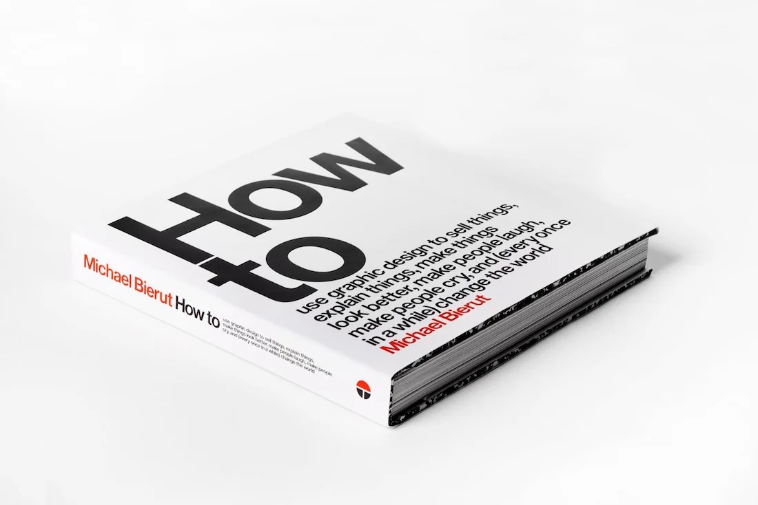
Michael Bierut: How To...Write a Book About Your Work
The first monograph, design manual, and manifesto by Michael Bierut, one of the world’s most renowned graphic designers — a career retrospective that showcases more than thirty-five of his most noteworthy projects for clients as the Brooklyn Academy of Music, New World Symphony, the New York Times and Saks Fifth Avenue, and reflects an eclectic enthusiasm and accessibility that has been the hallmark of his career.
Offering insight and inspiration for artists, designers, students, and any- one interested in how words, images, and ideas can be put together, How to provides insight to the design process of one of this century’s most renowned creative minds.
Read more > http://www.casualoptimist.com/blog/2015/03/19/michael-bi- erut-how-to-write-a-book-about-your-work/
Read More
The Latest Brands Destigmatizing Periods with Engaging Design
What’s the first thing you notice when you walk down the “feminine necessities” aisle of any supermarket or pharmacy? Everything on the shelves suddenly becomes a very distinct shade of pink, baby blue, and soft yellow—the favored colors for the flowers, hearts, and bows typically used to decorate boxes of tampons and pads. This is the visual language of feminine clichés, and none of it actually relates to the product’s intent.
Finally, sophisticated packaging for women sick of feminine clichés.
Behold here > https://eyeondesign.aiga.org/the-latest-brands-destig- matizing-periods-with-engaging-design/?mc_cid=49e2029e2c&mc_ei- d=839863aa25
Read More